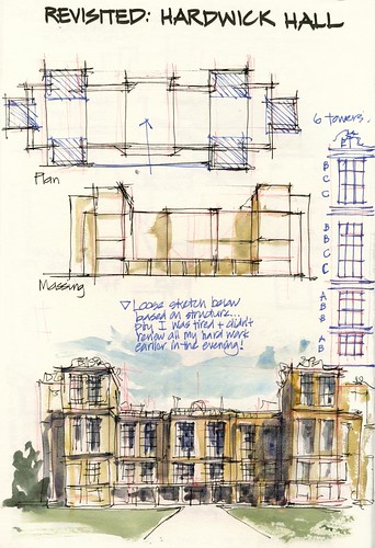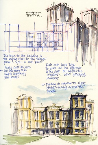
The two pages below represent another go at sketching Hardwick Hall. I was there last year and somewhat overwhelmed at the time (in a good way!) by the enormous windows “Hardwick Hall more glass than wall” that I drew the sketch above... Large sketch showing every pane of glass and got so sick of it by the end.
Today I wanted to achieve two things
1. Understand the building BEFORE I sketched it (last year on location I discovered things about the building while I was sketching and wasn’t able to correct my sketch as I was doing it on the run)
2. Find a more expressive way of sketching the building without having to draw every window.
Well I did achieve the first but sadly had a break in time before I sketched the building...so in effect lost the benefit of the analysis...so a number mistakes in the number of panes in the sketch on the first page... This sketch I faded parts of the building according to structure... ie. I started to draw the building from the centreline and faded my linework and colour as I moved out from the centre.
On the second sketch I sketched and painted in response to the light hitting the façade. This was a suggestion of John Haycraft and I am very excited about the possibility of exploring this idea further – following the light across a building.


Liz,
ReplyDeleteI'm enjoying this very much and gaining insight. Thanks and I look forward to more.
Frank