This blog is devoted to my architectural sketching adventures and musings about the integration of architecture and sketching.
I hope not only to share my own on-location architectural sketches but provide tips and methodologies for sketching and understanding architecture.
Also, most importantly, I wish to explore ways in which, in a digital age, we can not only defend but
promote freehand sketching within the architectural profession.

Monday, March 11, 2013

More interior versions....


I did three more versions of that little scene from Saturday... a more careful watercolour, watercolour without ink lines and watercolour pencils (this is what I used at work before I got into markers - I am just working on bond paper and using water sparingly...it buckles a little)
If you haven't noticed, I like doing the same subject multiple times...

Some people were having problems seeing the images on this blog and for other people it was fine...curious!... let me know if you can't see all three on this post.

If you couldn't see the images on the previous post- check them out over at Liz and Borromini here

Friday, March 8, 2013

Watercolour vs Marker


Sketching a few interiors today  and thought I would do a comparison between watercolour and markers. Both were done in a similar time frame - ie. a rapid rate. I scanned the base line drawing of the watercolour and then printed it out for the marker version (on bond paper)
I use my copic markers in the same manner I use my brush - very similar gesture and movements...but instead of mixing different colours I am madly scrambling to find the new colour, put on the lid of the colour just used and then open the right end of the the new colour (I am using the wedge end on this sketch)

Friday, March 1, 2013

Friday NIght Baroque with dissolving lines


As I am in such an inkless mood, I thought I would try a favourite Baroque facade to draw... I can't even think of the name of it but it is in Rome, near the Pantheon. This does look quite different from my usual Friday Night Baroque such as here and yet in essence there is only two fundamental differences.
1. instead of ink outline I used a raw umber watercolour pencil. I think my lines might be somewhat looser but not radically dfiferent
2. I am working with my watercolour paint a LOT wetter  - obviously the result of 1. above is that the lines are dissolving and the wetter paint is doing that even more.
I would like to try again with a little more control....

Wednesday, February 20, 2013

New style...

Sorry for neglecting this blog for so long... lots of stuff is happening (I ALWAYS say that!)
Thought I would cross post from my other blog here...
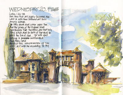


After yesterday's afternoon little sketching outing(see below), I decided that it is time for some studio experiments and developments. I am really not enjoying my ink lines at the moment and am getting such a buzz out of a spontaneous mixing of watercolour pencils and watercolour paint. So I thought I would experiment from a photo I took yesterday of the gatehouse to Rivendell (part of Concord hospital)
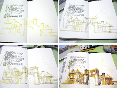


As my camera was handy I thought I would take a few photos of the stages...but once I started painting I forgot all about it. I also wasn't sure when I started what I was doing - so I started with a rough outline in yellow ochre WC pencil then added watersoluble pencil over the top (Derwent sketching light wash) . Next I mapped the basic areas of shadow/shade with that yellow WC pencil and then.... who knows. This isn;t quite doing what I had hoped to achieve - I feel the need to work bigger!
I plan to develop this technique in the coming days/weeks....fun fun fun! (well I am enjoying myself ...I think that it might show a little bit!)

BTW I am LOVING using this Stilllman and Brin alpha book to be loose and rough and record my daily explorations without any pressure. I am less inclined to be journalling (though that is still happening) but definitely using it more as a working sketchbook. The paper is great for what I am doing - very robust for the workout I am giving it...but I am very much looking forward to getting into a Beta book next!


Here is my crazy attempt from yesterday.....
130219 Rivendell Concord

Tuesday, December 11, 2012

Testing out new paper with a Baroque sketch


Life has been a little crazy lately so I haven't had time to post here as much as I would like to... but of course I have still been sketching a lot of architectural subjects during the week - of course you will find more activity over at www.lizsteel.com (as long as you don't mind getting a lot of tea cup sketches as well)

I am cross posting this sketch from last night over here for the simple fact that when I wanted to really test some new paper designed for ink and wash (read all about the upcoming Zeta paper from Stillman and Birn here) I just HAD to have a go at a Baroque facade.

The very simple divisions of Borromini's San Carlino (3 bays across, and 2 storeys) and the lovely combination of concave and convex curves and the crazy decoration is just perfect for allowing my hand to do its own thing and find its own way over the smooth (oh! so smooth) surface of the the Zeta paper)

And then of course I splashed some paint on!

I am definitely committed to posting more regularly here in the new year! Seriously! I mean it this time!!!

Thursday, October 4, 2012

Back again sketching St Leonard's church

If you haven't realised I like to come back to the same subjects over and over again. Hoping one day I will nail it totally.

Working at a larger scale helps - a4 rather than a5 at other times.
So hot in the sun this morning so once again no proper perspective setup.

Friday, September 28, 2012

White house on the corner

My morning sketches are great training exercises as I have so limited time 15min max and just got to go for it.

This morning I followed an impulse to sketch this house. Didn't bother setting up perspective lines but I did start at the top and get those main roof forms first.

LinkWithin