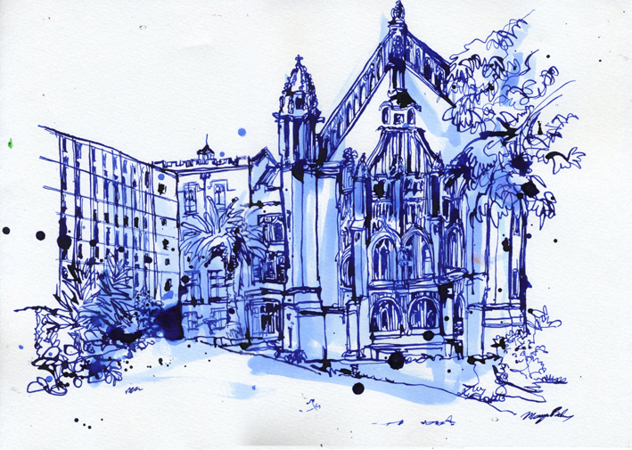
This blog is devoted to my architectural sketching adventures and musings about the integration of architecture and sketching.
I hope not only to share my own on-location architectural sketches but provide tips and methodologies for sketching and understanding architecture.
Also, most importantly, I wish to explore ways in which, in a digital age, we can not only defend but
promote freehand sketching within the architectural profession.

Tuesday, September 11, 2012

Analysis of what I did this morning

120911 Analysis of what I did this morning 1


120911 Analysis of what I did this morning 2

Further to a few comments - here is an analysis of what I did this morning.
I don't have time to write a detailed description but hopefully these notes make sense- please ask questions... (I suppose some people want more details about the eyeline???)

in summary - always establish the main proportions of the building and the space between you and the building (if you are draw that) BEFORE you get distracted by details. Then work within this guidelines. If you make a mistake either- reinstate or just run with it (most people will not know it is slightly wrong...but you have learnt from it)

Context vs Object Explorations

120911 Context vs Object Exploration2
I am stealing my own thunder a little but I just can’t find time to complete my post about the Jefferson Library. However I have decided to use my morning walk and sketch to explore a few ideas.
In summary (also refer to notes above)
Context sketch
– START sketching the foreground first so not distracted by building details, and the space between you and the building is more convincing and more of the focus of the sketch
- focus more on the 3D form //massing of the building.
120911 Context vs Object Exploration1
Hopefully my notes make some sense and explain further... These were really rushed this morning....(as you can see I am enjoying scribbling working drawings in my sketchbook these days!)

Please ask questions....

Monday, September 10, 2012

Monday morning sketching at St Leonard's

I am really getting into groove with my morning walk and sketch before work and have realised that this church, St Leonard's is a great subject to come back to. Since its form is very complex. Another favourite is the big brutalist concrete building. So I am going to plan a few specific sketching exercises for myself.

At the moment I am still exploring markers. And today was an object based sketch.

So nice sitting on a kerb in the sun this morning.

Friday, September 7, 2012

This Week: 7 Sept 2012: Mad about markers


120905 St Leonards Naremburn


I feel like I have been so busy lately and haven’t had any time to re-visit my Jefferson Market Library sketch as I promised. I am just so hopeless at sticking to a plan...and doing two things at the one time.

This week almost out of the blue, I have gone mad about markers. Most of you will have noticed this on my blog/flickr/facebook.

120831 Morning markers


120903 Old CBC bank

The inspiration is Eduardo Bajzek and his great workshop that I did at the Urban Sketchers Symposium. While I am not using the markers the way he uses them, I have been exploring them Liz style and am constantly referring to his stuff.

120904 St Thomas Rest Park(5 mins there, 2 mins later)

So here are all the sketches I have done in 5-15 minutes before I started work for the day. Most have some kind of architectural theme. Because my time was extremely limited and my focus was experimenting with the markers and the best colours (how to mix colours), my sketches are very loose. No real thought about composition or perspective, just ...see, respond, sketch and THEN think about how to tackle the colour with markers.


120906 FULL colour markering

I am mainly using Copic markers and will be posting my selection of colours soon. It is amazing that a succession of 6 mornings in a row, sketching on location with a new medium is a great way to get a feel how to use it.

Friday morning: markering from the gutter

I posted this elsewhere...but just for the record on this blog...here are my thoughts after first few days.


What I love
- so easy to get clean fresh colours (no messy, dirty mixes)
- very little drying time (I can sketch more as can almost instantly turn the page and start sketch no. 2 or 3 or 4!) Also nice not to have to walk the streets holding my book open and checking to make sure I have not unexpected runs of wet watercolour paint
- it is the same action as when I am drawing – ie. I am using a pen. it is the hand/ head dialogue that gives me great joy in exploring an object. I don’t quite get the same experience when I painting- I love splashing pigment and water around, but it is the drawing side (as an architect) that is my foundation
- solid block colour rather than linear/stroke based colour of a wc pencil... Easy to colour a large area quickly and can produce a perfect solid uniform wash
- overlaying of colours is very exciting ... No murky mixes!
- blending opportunities to explore
- I am loving using these markers in a loose way (rather than the traditional polished manner) and seeing how my personal watercolour style is translated to a different medium
- I am really want to explore the massing of colours that Eduardo does – so amazing his work – and using markers I think will be a great way to explore more painterly work which I can then translate back to watercolour

What is not so good
- They are expensive and you need a lot of them as there is a limit to how much you can layer.
- The colours are so nice... That I want MORE... I have bought more than I need already and still need to go to my art store to get a rose/magenta colour... Will I come away with only one ...or more?
- Good to have wet and old dried out pens for some effects – =more markers...
- They bleed through the paper... Almost any paper
- Not as convenient to hold many colours when on site (vs my little watercolour kit that I can create unlimited colours from) and you MUST put the lid back on immediately after use. Of course I am working fast (very fast) and constantly changing pens (sketching like a mad woman even more than usual!). This adds a little to the adrenalin rush that I get from sketching (so this is a positive, I suppose... I come into work pumping as a result!!!)
- Need a range of light.mid and dark colour... = More markers....and be careful with the dark ones... Once on the page you are stuck with it!
- Fumes? Not an issue outside but could be an issue inside (the old yoken pens were far worse)

Ok.. That's all that I can think of after a few days of using them ( only 5 days worth...seems longer than that!)
I am NOT trying to convert everyone to rush out and buy a heap... I am not sure that they would work for many of you....but I just can't help sharing my excitement with you all!

Please let me know if you have any questions and I will try to answer in a later post.

Thursday, August 30, 2012

Thinking about my Jefferson Market Library sketches

Thinking about my Jefferson Market Library Sketches


Here are two sketches of Jefferson Market Library (Greenwich Village) that I did last month while in New York. As you can read in my notes on the second sketch, I was having a little ‘crisis’ between object vs context sketching. Please don’t take my melodramatic way of talking about my mental thought process while sketching too seriously...I wasn’t really having a crisis...more like a stimulating discussion in my head.

As an architect, I am very interested in individual buildings ... Although how they sit in their surroundings is very important, I often find that I focus more on how the building is put together. In many ways sketching an individual building as an object is fairly easy for me – I have years of training of how to see and draw the structure of a building and if the lighting is good, the light and shade help to define the building form without me having to think about it too much. Sketching a building in context is a totally different thing....

There is no doubt that each Urban Sketching symposium I attend makes me more aware that I should be drawing more contextual sketches – they tell you more about the place (rather than just the object) So this particular day I started sketching this magnificent building and made sure that I included the context. Although I am quite pleased with this sketch I am not 100% happy for a number of reasons
- I don’t feel as comfortable drawing people and cars and these are an important part of the context (yay! For NY yellow cabs!) Also I feel that I need to define the foreground better, including traffic lights. Garbage bins, signage etc. (I am often too lazy/loose to do this properly)
- I didn’t feel like I had done the building justice- it was too small on the page, and I didn’t get into the nitty gritty of its architectural elements and how it was put together... Therefore I did the second sketch to satisfy this need. This type of sketch is the way that I get to meet and explore the character of the individual building... Yes, it is like meeting a person as I get insights into the why and wherefore of the original designer...I notice things that I am sure he or she took a lot of pains getting right. If I had stopped at the first sketch, I would have missed out on this.
- it was a grey day and the values were not really planned convincingly at the time

In essence I feel the sketch is halfway between an object sketch and a context sketch ... I fact I starting sketching the building and then extended it out to include the context but on reflection what I should do in future is START with the context, start with the space and then think about how the form (not al the details) of the building relates to is surroundings and then sketch what I think it appropriate.

So, look out for part 2 of this post in the next week as I experiment with a different approach. (At the moment I am really enjoying thinking about and re-visiting my on-location sketches ... It seems to be a much more stimulating and rewarding exercise than sketching from photos)

Saturday, August 18, 2012

Newtown Post Office - On location and back home


120819 Newtown Post Office
Today I had 20 mins spare before meeting friends for lunch and so I decided to do a quick sketch of the building that caught my eye a fortnight ago when I was there.

From all my extensive sketching, I know that this was an unrealistic time to do a ‘proper’ sketch...but of course I still tried. So what resulted was a very loose sketch. I used my usual red pencil guidelines only for mapping the overall shape on the page and then went for it in ink without any real regard for perspective.

I also was so focused on my time limit that I just went for it without really thinking about whether I could have strengthened (and quicken) my sketch by focusing on one element/ part of the building.
A few other things - I painted the sky first, something I don't always do. I also left the King St facade white as it was sunlit (in fact both facades where in the sun but I made the choice to add shade to the side street facade) I find red brick buidling hard to paint and often feel my sketches are too heavy.

Anyway, I decided to have another go back home- using my knowledge from the above sketch and also looking a little more carefully at the building (via a photo)

Now before I get into that, I want to highlight some amazing posts by Meegan (a fellow Sydney sketcher and friend) about sketching architecture. Her comments are extremely thought provoking and her work inspiring.

Here is one of her recent sketches - but Please go over to her blog to read her post here and here

One of the comments that has got me thinking (and it was also something that came up at lunch today) is sketching architecture without pencil lines. I personally do not have a problem with using pencil for the set-up - grid lines of a building (ie. not ever line in pencil first)   I find that if my pencil lines are limited, and when I go over with ink I make corrections as I go, my inklines still retain their spontaneous nature. BUT, tonight I thought that I would go ink only. In the past when I go ink only, I normally use a re-instated line approach (ie. loose and multiple lines) For more see here
So tonight I wanted to do ink only and neat (well neat-ish... I am never really neat in my sketchbook)... a bit of an experiment.


120819_4 Newtown PO Structure
To do this I decided which where the important lines in the building (well, I do this always) but it was more important to try to nail this step when only inking. So here is a photo with the lines of the main parts of the building. I often use the top leading edge of cornices to define each storey. The cornice is the band of sandstone going around the building. It often tells me things about what the surfaces of the wall is doing as it often (mostly) steps when the walls step. I also start from the top and work down - this avoids the tower off the top of the page.
120819_5 Newtown PO

And just in case you want to see the building without my green lines...

120819_2 Newtown PO Back Home Setup


So here is my outline, I didn't use the back of my nib to create a lighter line- but perhaps I should have. Anyway... I was going to have to live with this - but you can see that it has mapped out the whole of the building and I can now sketch without stressing about whether I will warp and go off the page.
The only other thing of note is that I decided to do the eyeline- the horizontal line which is at the same height of my eye. This helps me get the perspective lines more correct (but still my perspective is not perfect...but hey, I am not going to loose  any sleep over it!)


120819_3 Newtown PO Back Home
And here is the final sketch... a few points
- I decide to paint both facades but instead of just using burnt sienna (or my verison of that colour) which isn't actually the colour of the brick, I mixed it with pyrrole orange which has made the building brickwork more lively... I am liking this!
- added a little more shade to the side street facade
- my general line work was a little more 'neat' than those setup lines but you can't really tell - even the eyeline line is not that obvious
- My tower wasn't right proportion but rather than correct it, I decided to live with it
- I added the sky last when I had a better feel for the overall page
- I need to work on my cars (and of course people)

I must say that I have found this exercise of re-doing a sketch very helpful - more so than sketching a random italian baroque facade from a photo!
And also finally.... I am not making any judgement as to which one is "BETTER"... it is all about enjoying the process, and learning and trying out new things all the time!!!
I am intending to be more dilligent with posting to this blog... I have so many posts planned... but it is a challenge to find the time for them.

Wednesday, August 8, 2012

I will be back soon....


D01_Fri06_06 Cathedral front (west) facade
I haven't forgotten about this blog but I was so busy preparing for my big trip this year - to Santo Domingo last month for the third international symposium and then a week in New York. Now I am madly scanning all the sketches from the 3 sketchbooks I filled in 3 weeks.

So stay tuned as I I have lots I want to share about the architectural sketching I did in both locations and report on the workshop I taught in SD with Frank Ching.

In the meantime, here is a sketch I did of the entrance of the Cathedral in Santo Domingo. I did this on my first afternoon, when I was somewhat sleep deprived but totally overawed by the architecture and feel of the city.

LinkWithin