This blog is devoted to my architectural sketching adventures and musings about the integration of architecture and sketching.
I hope not only to share my own on-location architectural sketches but provide tips and methodologies for sketching and understanding architecture.
Also, most importantly, I wish to explore ways in which, in a digital age, we can not only defend but
promote freehand sketching within the architectural profession.
Monday, April 11, 2016
Sketching Architecture Resource Page over at lizsteel.com
Just to let you all know that after a few years of being unable to post regularly to this blog I have decided to retire it and instead focus on providing better instructional content over on my newly re-designed site lizsteel.com.
I have a dedicated resource page just for Sketching Architecture which will contain an index of all my best posts. So I hope that you will go over and have a look.
I have a few pieces of exciting news coming up on the topic of Sketching Architecture coming up in the next few months so the best way to keep in touch is to sign up for my monthly newsletter.
Thanks!
Monday, January 4, 2016
UK Architectural Drawings
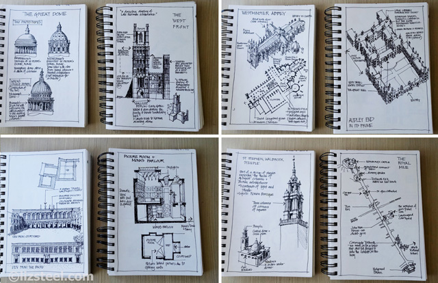
A little look at the architectural study drawings I did after my first trip to the UK in 2000 - read more over on my blog.
I also shared some of these drawings here .
Saturday, March 21, 2015
Another Sketching Architecture workshop
Only a few spaces left for my new 2 day Sketching Architecture workshop - please email if you are interested... it is proving to be popular!
I am super excited about this... it is GOOD to be teaching architecture sketching again. And looking forward to teaching my 'pointless perspective' approach (more details soon)
More details here... and blog post about my 'prep' work here
Friday, October 17, 2014
The Perpective issue again...
Musings further to sketching Lambton Rotunda - sketching it myself and instructing others during my travel sketching workshop last month for Newcastle Art Society.
Do you need to understand perspective to draw buildings or do you just draw what you see?
How do you draw what you see - how do you switch off the objective brain and use your visual brain?
When something looks wrong can you work out how to fix it?
I share a few ideas (for starters!) over at my main blog.
(I have been working hard over at my blog and my new SketchingNow online class site and hoping to get a fully integrated solution for this architecture blog soon - I promise!)
-------------------
Tuesday, July 1, 2014
A building I DID sketch again - Tasmanian Heritage Council Building
So... first day in my trip to Tasmania last month I did sketch 'that' building from my previous post that I sketched in 2005. That building is what I call the 'Butler Bank building' - originally the Commercial Bank designed by Frank Bulter in 1866. It is now the home of the Tasmanian Heritage Council.
There are some sketchers that once they have sketched an object or scene - it is 'done' and they want to do something different. I am the opposite. There is a part of me that wants to sketch the same thing over and over again. It is like visiting old friends - like renewing acquaintances and having a new dialogue with them (hmm, not only do I talk to myself - I talk to buildings so it seems!)
I also think there is a lovely creative memory that is brought back when you sketch something for the second time. (or third or fourth) To quote from my sketchbook
"It is a really complicated building - of course I looked at my first sketch of it (from 2005) recently but I do think that I would have remembered it (it = its design and basic configuration) - or at least what to look out for"
Anyway - I thought I would share with you a diagram what I saw at the time - this is what I drew first. I often (not always) do a very quick setout with watercolour pencil of the main guidelines and you can see these lines in this diagram and how I adjusted the spacing when I drew with ink.
There are lots of lovely design features - double columns, square and round, interesting patterns of brackets and modillions.... but nailing this overall structure is crucial to put all the details together. A beautiful building.
As I have said often.... the most important thing about sketching architecture is the ability to be able to see the structure.

And finally, here is a sketch I did at crazy pace the next day. I didn't do any setup lines but just went for it. This is the waterfront facade to TMAG - Tasmanian Museum and Art Gallery.
I made many mistakes while I was sketching this... but I am struggling to see them all now... 'just keep going' is another important piece of advice I give when it comes to sketching architecture (and many other things as well)
There are some sketchers that once they have sketched an object or scene - it is 'done' and they want to do something different. I am the opposite. There is a part of me that wants to sketch the same thing over and over again. It is like visiting old friends - like renewing acquaintances and having a new dialogue with them (hmm, not only do I talk to myself - I talk to buildings so it seems!)
I also think there is a lovely creative memory that is brought back when you sketch something for the second time. (or third or fourth) To quote from my sketchbook
"It is a really complicated building - of course I looked at my first sketch of it (from 2005) recently but I do think that I would have remembered it (it = its design and basic configuration) - or at least what to look out for"
Anyway - I thought I would share with you a diagram what I saw at the time - this is what I drew first. I often (not always) do a very quick setout with watercolour pencil of the main guidelines and you can see these lines in this diagram and how I adjusted the spacing when I drew with ink.
There are lots of lovely design features - double columns, square and round, interesting patterns of brackets and modillions.... but nailing this overall structure is crucial to put all the details together. A beautiful building.
As I have said often.... the most important thing about sketching architecture is the ability to be able to see the structure.

And finally, here is a sketch I did at crazy pace the next day. I didn't do any setup lines but just went for it. This is the waterfront facade to TMAG - Tasmanian Museum and Art Gallery.
I made many mistakes while I was sketching this... but I am struggling to see them all now... 'just keep going' is another important piece of advice I give when it comes to sketching architecture (and many other things as well)
Saturday, May 17, 2014
A building I have to sketch again in Hobart
Before I sketched, I used to take a lot of photos and put together elaborate photo books from my travels.
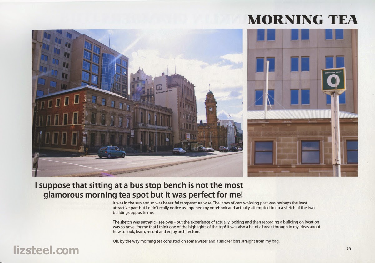
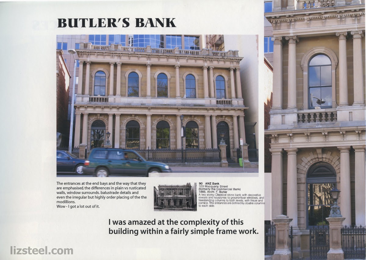
In 2005 I had a long weekend in Tasmania of 5 days. I put together a 160 page book which I printed myself of quality paper and got professional bound. Here are three pages from that book….and the important part of these pages is that it records my first ever attempt to seriously sketch a building on location.
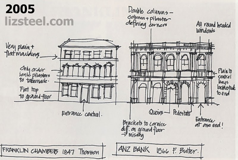
I just love the comments that I wrote at the time
"actually attempted to do a sketch of the two buildings opposite me"
(comment: I always wanted to sketch but never found the time)
"the sketch was pathetic - but the experience of actually looking and then recording a building on location was so novel for me that I think it is one of the highlights of the trip!"
(comment: love the process of looking and record and not concerned by the result)
"it was also a bit of a break through in my ideas about how to look, learn, record and enjoy architecture"
(comment: this is also very interesting - I think the same things often! I am always having break throughs and new ideas as how to look, learn, record and enjoy)
"I realised after attempting this sketch that I would be better off sketching diagrams and details rather than try to draw the whole elevation accurately - this is just too hard for me to achieve on location - at the moment anyway, till my skills improve"
(comment: ironic thinking that sketching was too hard… but realisation that I need to work on my skills"
"Wow - I got a lot out of it"
(comment: exactly!)
Friday, May 9, 2014
A very quick sketch of complicated building
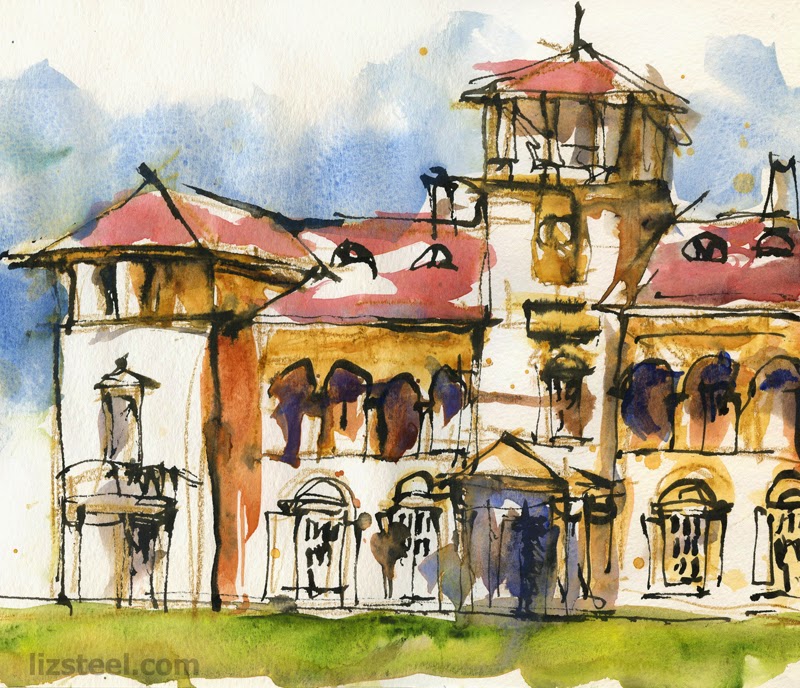
Those of you that follow my daily blog would have seen these images during the week (from last Saturday's USK SYD event at Rivendell Rhodes), but I want to write a little more about the step by step of this somewhat crazy sketch.
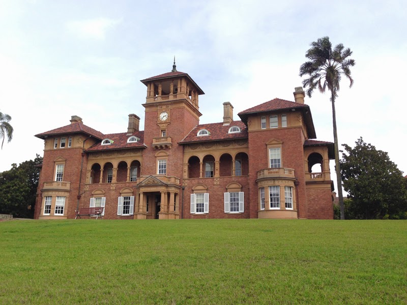
The whole thing was completed in just over 15minutes and has been done in a large A4 moleskine watercolour book (so the width of the sketch is 2 x A4) I think this is the fastest sketch I have ever done at this scale. I have been doing a lot of sketching lately so am 'in the groove' and therefore decided to risk attempting this sketch of a large complex building in a short time frame.
So… a few comments on my approach (which in many ways was unplanned)
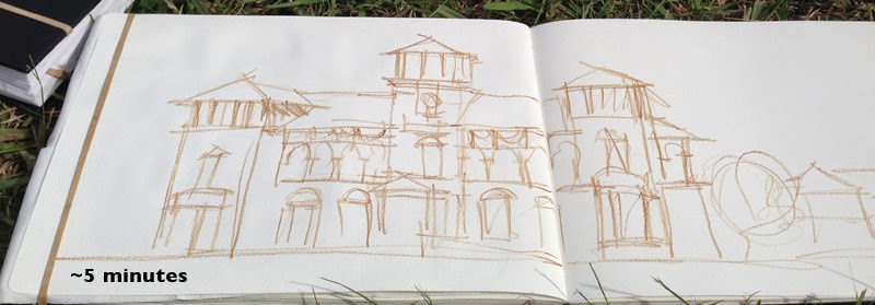
First: I knew I didn't have much time so I decided to go with watercolour pencil - I certainly find using pencil of any kind a lot freer than ink. I started with the main tower (I always seem to start from the top and this is the important feature of the building) and then worked left then right (running out of steam as I moved right… sometimes it is good to be impatient… my 'running out of steam' is a good way of not overworking secondary elements - I was not sure how much of the secondary building I would want to include)
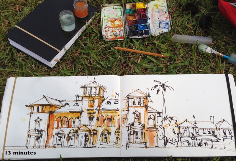
Second stage: I haven't really decided what I was going to do (ie. I didn't necessarily intend to use ink) but as time was short so the paint had to get on as soon as possible. So I quickly splashed on some colour in the areas of shade/shadows. After doing this, I realised that it would take too long to try to build this sketch up with paint - it would be a lot quicker if I had ink lines to hold it together so pulled out my sailor pen (with an up-turned nib) and added the major edges. All of that scribbly pencil work provided guidelines and helped me be strong and confident with my ink.
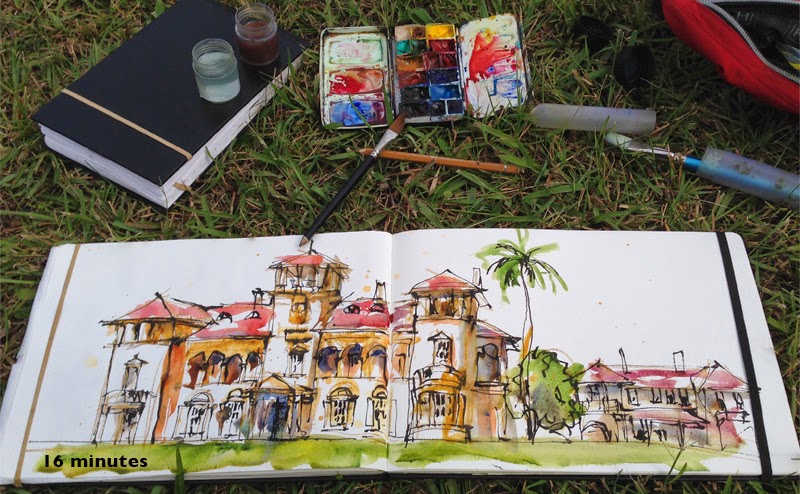
Third stage: Running out of time… so quickly splashed on more colour … can't really explain in any detail… just going with the flow at a crazy exciting pace. As soon as I thought "should I do sky? - do I have time?" I paused and then realised it was time to go for the show and tell.
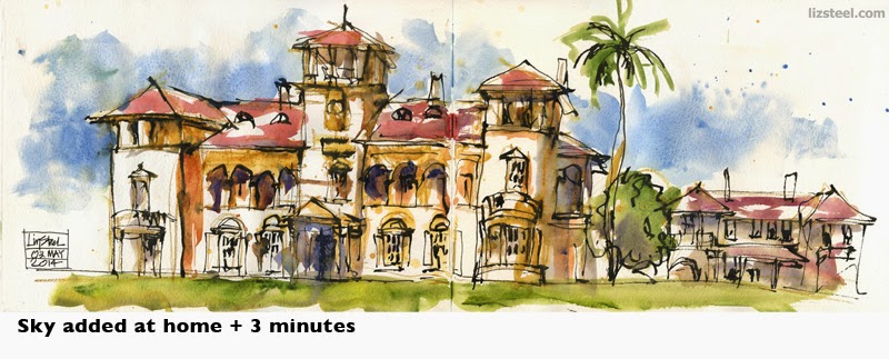
Finally: I decided to add the sky once I got home as there was so much white on the page… and having blue sky was a rather special part of that morning (had been raining when we woke up but turned out lovely for our sketching event)
Anyway - there are a lot of 'mistakes' in this sketch - things that don't align or are not evenly spaced… but do you think I will lose sleep over that? NO!
This sketch is another example of my approach to sketching architecture: the most important thing is to understand the major components of the building form .. and not to stress about perspective
(hmm, was I supposed to use perspective on this sketch?? - oops didn't even enter my head!!!)
I hope that seeing the stages- and in particular the first stage is useful to see what I think is important…
Subscribe to:
Comments (Atom)


